The Key Secret to Great Design
 The Consumer Electronics Show (CES) is now a few weeks behind us, and let me ask you this:
When’s the last time you donned 3D glasses to watch Big Bang Theory in 3D in your living room on your curved 4K TV?
Never? So you mean all those 3D display smartphones that manufacturers were showing off at last year’s CES didn’t take the mobile world by storm?
To be fair, my father-in-law did buy a 3DTV. And he has used the 3D exactly twice: Once to test it for himself, and once to show it off to me. And then never again.
My point in all this is that a hot new trend in the moment doesn’t always become the future. Sometimes a trend is actually just a fad.
And that’s why I don’t want you to chase your tail following trends in online marketing design. I want you to focus on what will forever be the most important element of design.
Hierarchy of content and assets.
Bingo!
Here are the current design buzzwords:
- Flat and material design (think the operating systems for Apple and Android phones)
- Parallax (long scrolling pages where text and images animate in when you reach a certain section of the site)
- Single page (websites that store all their key information on the homepage and have navigation that “jumps” a user to the appropriate section of that homepage)
These are all great techniques when used effectively. My point is not to avoid these style options. My point is that using them does not automatically mean that you will have an effective result. Successful design is more about the structure of assets than the style aesthetics. Or as our interactive director puts it, “design without problem solving is decoration.”
In order to be a problem solver instead of a decorator, in order solve the problem of creating an effective campaign, start by ask questions.
Determine the purpose of your campaign and build toward it
Before designing your website, or landing page, or banner ad, consider the purpose of it. Ask yourself these questions:
- What is the goal of my site / ad / etc.?
- What are the goals of each page / slide / etc.?
- How can I lead the user to perform the action that accomplishes that goal?
These answers should be the driving force of your design. Maybe a flat, sparse design with pops of color is exactly what your banner ad needs. Maybe a single page website is the best way to tell your story. But maybe there’s another technique that would work better to lead your visitor’s eye to the form you want them to complete, or the PDF you want them to download. The focus should always be on the hierarchy of assets; the structure of the page.
What do I mean by hierarchy? And by assets?
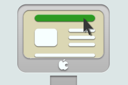
Content hierarchy means the layout of the design. Where all the pieces fit. The placement (and treatment) of “assets” including content, images, calls-to-action, forms, callouts, and any other elements worthy of inclusion. In essence, it’s the user experience.
Consider this: a hot trend in phone applications right now is stark black and white. There are successful games in the iPhone app store that consist entirely of blank lines on a white background, but the way the lines move and work together creates a work of interactive art. Just black lines on white.
Or consider this: one of our designers could create you a blog that’s so simple to scan you breeze through three or four articles before you’ve realized what’s happening, using only black text on white. It’s the way he breaks up the content with subheads, and paragraph breaks, and bullets. The way the page is structured causes easy readability, not the way it’s designed. Think of the incredible popularity of the iPhone app Instapaper, which is nothing but black text on white.
It all comes down to the hierarchy, the structure. Figuring out what the most important elements are and fitting them into their optimal place. How should the content be broken up, where should the images be placed, where does the eye look for the button that performs the action?
And in today’s world: does it work equally well on computers, tablets, and phones?
Forever young
A good structure is timeless. If you get the layout right, it can last you years, while you change the design, the color palette, in essence the coat of paint, to fit the current modern aesthetic. Yes, there is absolute truth to color informing people’s reactions to design. Red buttons gather more clicks, blue can make something feel cold, purple denotes luxury and sophistication.
But color (and really all of design) is subjective. Your CEO may love a certain look, but it turns off your target audience. Design can and should be tweaked to achieve maximum effectiveness. It’s why colors and design styles are the most common changes in A/B split tests.
But if you’ve got the content hierarchy right, that’s all window dressing. That’s all gravy. Pretty is absolutely important. But the right structure is essential.
Don’t follow the latest trend. Take off your 3D glasses and ask yourself what’s the best way that your site or ad or whatever should function. Build for that. And then paint it however you want.


